
Hazte el Favor
I partnered with copywriter and creative strategist Jit García to develop the visual identity for Hazte el Favor, a personal brand built around intentional promotion, storytelling, and creative self-trust.
BRAND IDENTITY / ILLUSTRATION / ART DIRECTION
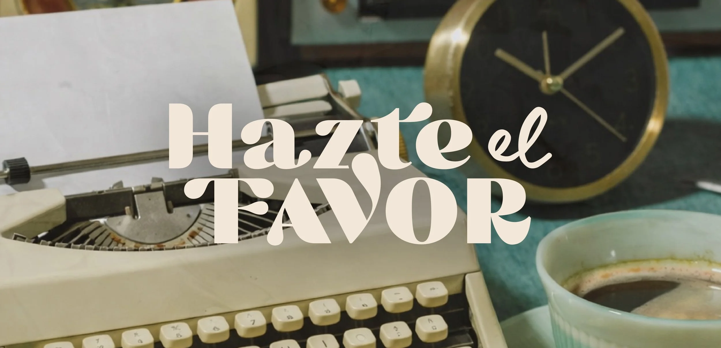
Creative Direction
More than a visual identity, we built a creative ritual.
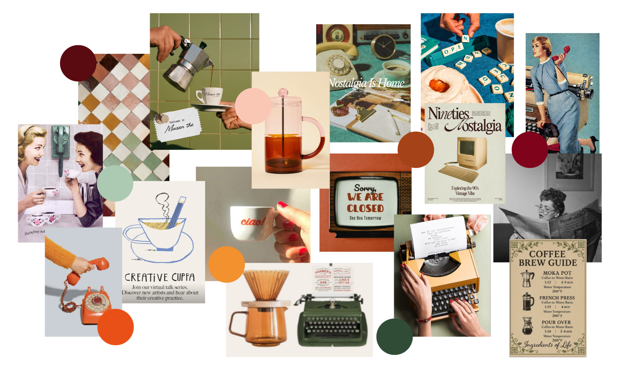
The brand was inspired by the quiet moments that often come before our best ideas: sitting down with a notebook, brewing coffee, highlighting a sentence, or finally finding the words you've been searching for.
Instead of creating something that felt polished or corporate, I wanted the identity to feel lived in. Coffee stains, paper textures, handwritten notes, vintage objects, and editorial layouts all became visual metaphors for slowing down, trusting your voice, and taking the next step with intention.
The result is a brand that feels less like a business and more like an invitation.
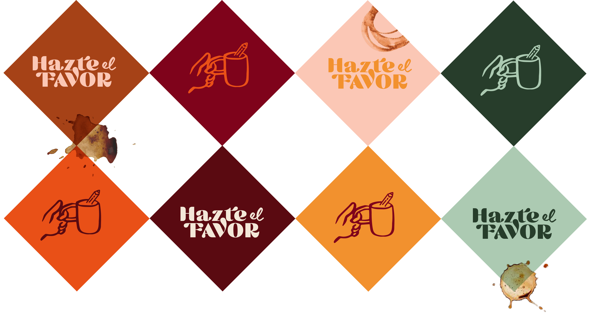
A logo designed to feel expressive, confident, and unmistakably human.
The Hazte el Favor logotype combines bold editorial typography with softer handwritten details, creating a balance between confidence and warmth.
One of my favorite details lives inside the lettering itself. The flowing connection between the "V" and the rest of the composition feels almost like rising coffee steam or a drop of ink, subtly reinforcing the themes of writing, reflection, and creative rituals without becoming literal.
Rather than designing a logo in isolation, I wanted the mark to feel like it belonged inside the larger world we were creating.
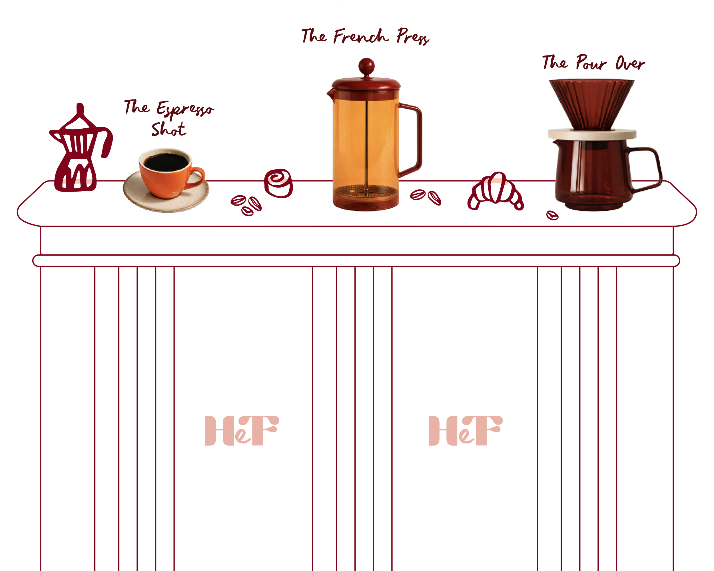
THE ESPRESSO SHOT
A focused, high-energy session designed to provide immediate creative clarity and actionable next steps.
THE FRENCH PRESS
A collaborative working session where ideas are explored, refined, and transformed into a stronger foundation.
THE POUR OVER
A slower, more intentional coaching experience built around reflection, long-term strategy, and sustainable growth.
From tasting notes to preparation styles, every detail reinforced the metaphor while helping potential clients immediately understand the purpose of each offer.
Building a Coffee Menu
Turning services into something people could immediately understand.
One of the biggest conceptual breakthroughs was reimagining Jit's one-on-one offers as a coffee flight.
Instead of presenting services as standard coaching sessions, we built a café-inspired menu where each offer reflected a different rhythm, depth, and experience.
BRAND
COLLATERAL
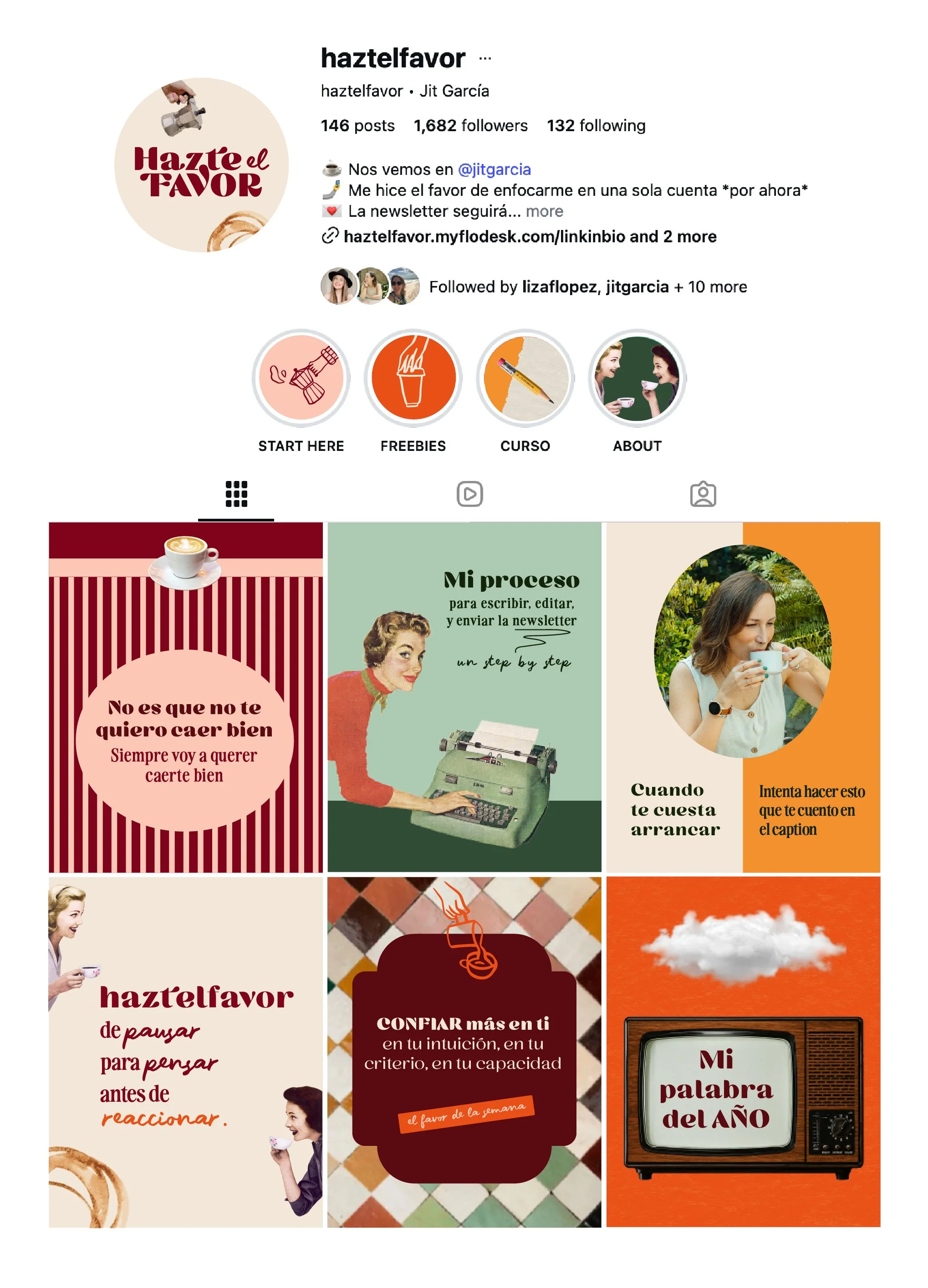
Instagram Graphics
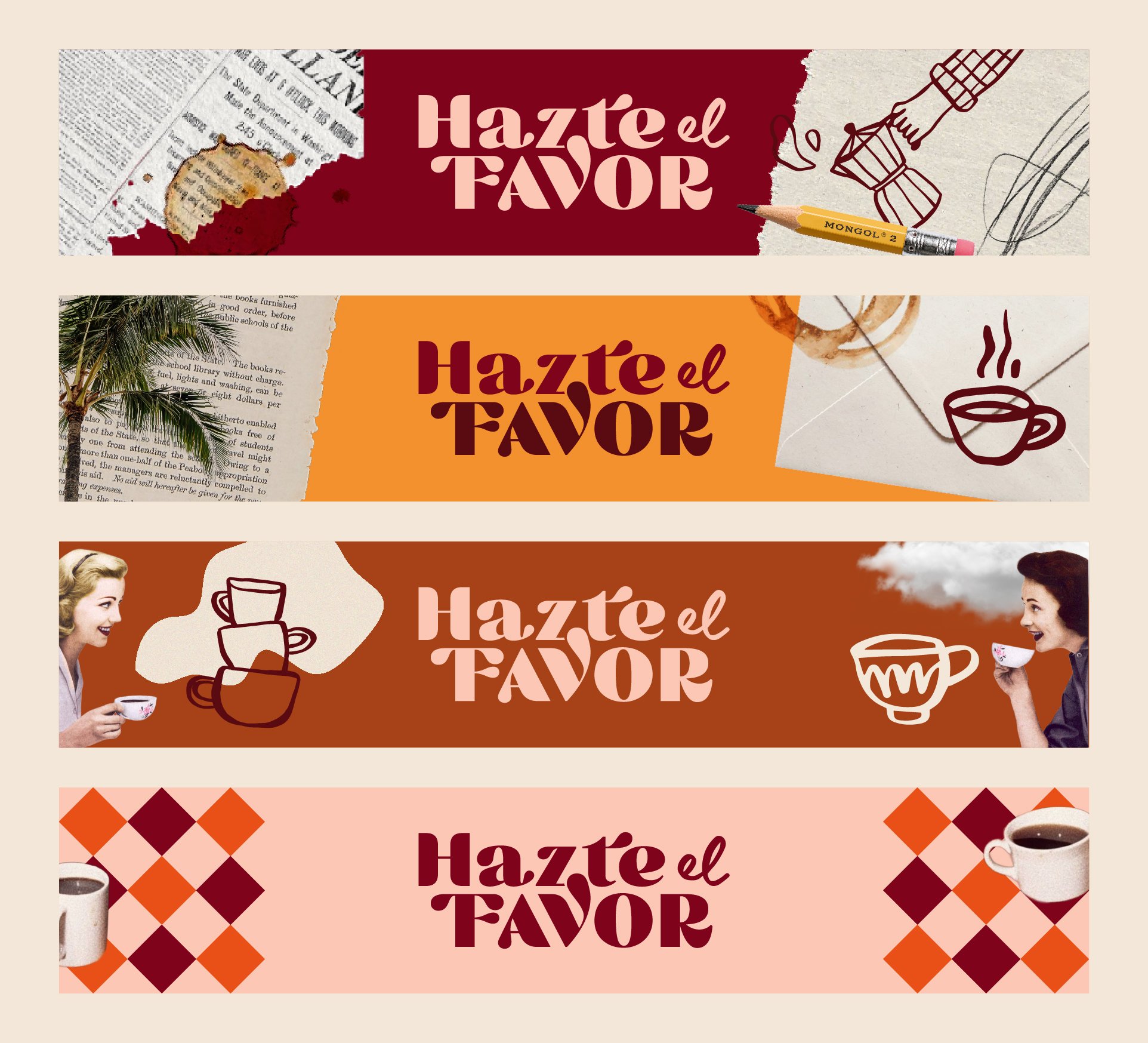
Substack Banners
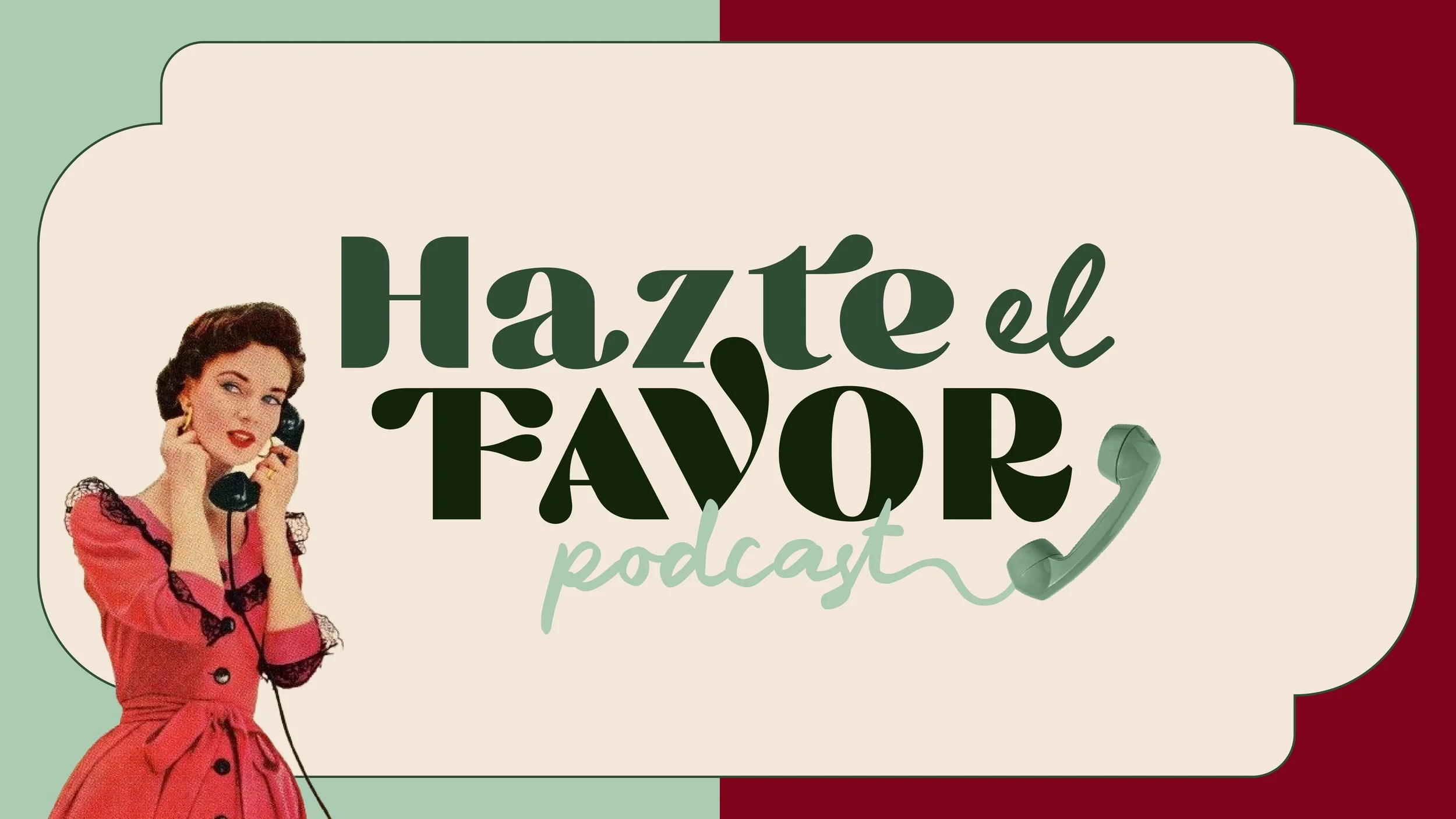
Podcast Artwork